Tomorrow Problem
Every new technology needs a new visual language. From a perception challenge to a multi-format visual system — teaching an AI feature to feel human, not intimidating.
01
Context
Prezi already had an established brand. The launch of its AI features introduced a new challenge: helping people see AI as approachable rather than intimidating. Marketing defined the campaign strategy, and my role was to translate that message into a visual system that could scale across templates, videos, emails, and product experiences.
02
The challenge
The challenge wasn't designing for AI — it was making a new technology feel approachable. The visual language needed to reduce complexity without losing credibility, working consistently across marketing and product touchpoints while staying true to the existing brand.
As the visual designer, I developed and applied the visual system across videos, email campaigns, product templates, and launch assets.
03
Process
The marketing message — AI as something human, not a barrier — became the filter for every visual decision that followed.
Human, not machine
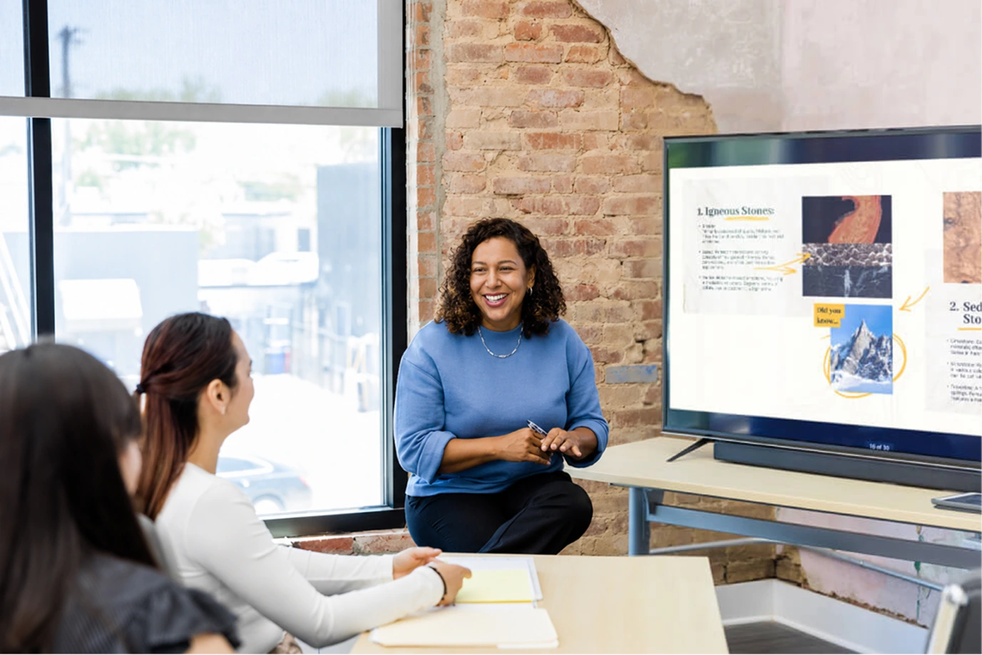
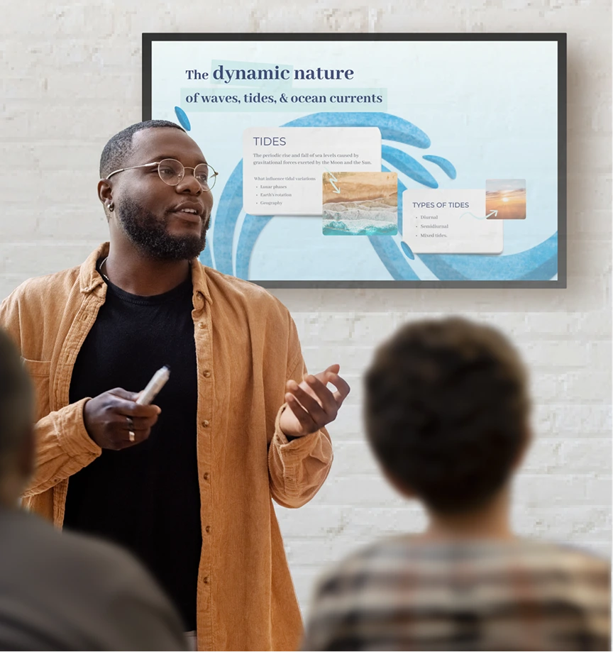
We prioritized real people and real presentations over abstract AI iconography — the most direct way to say "this is for you."

A fast, direct contrast
A quick before/after — from the friction of the learning curve to the fluency of using AI — condensed into a few seconds.
Simple, everywhere
The idea reduced to its simplest form: as fast as making a cup of tea. Templates carried that simplicity alone, consistent across segments. Every asset was built from the same three elements — a base template, the user's own content, and a short AI prompt.

Visual language
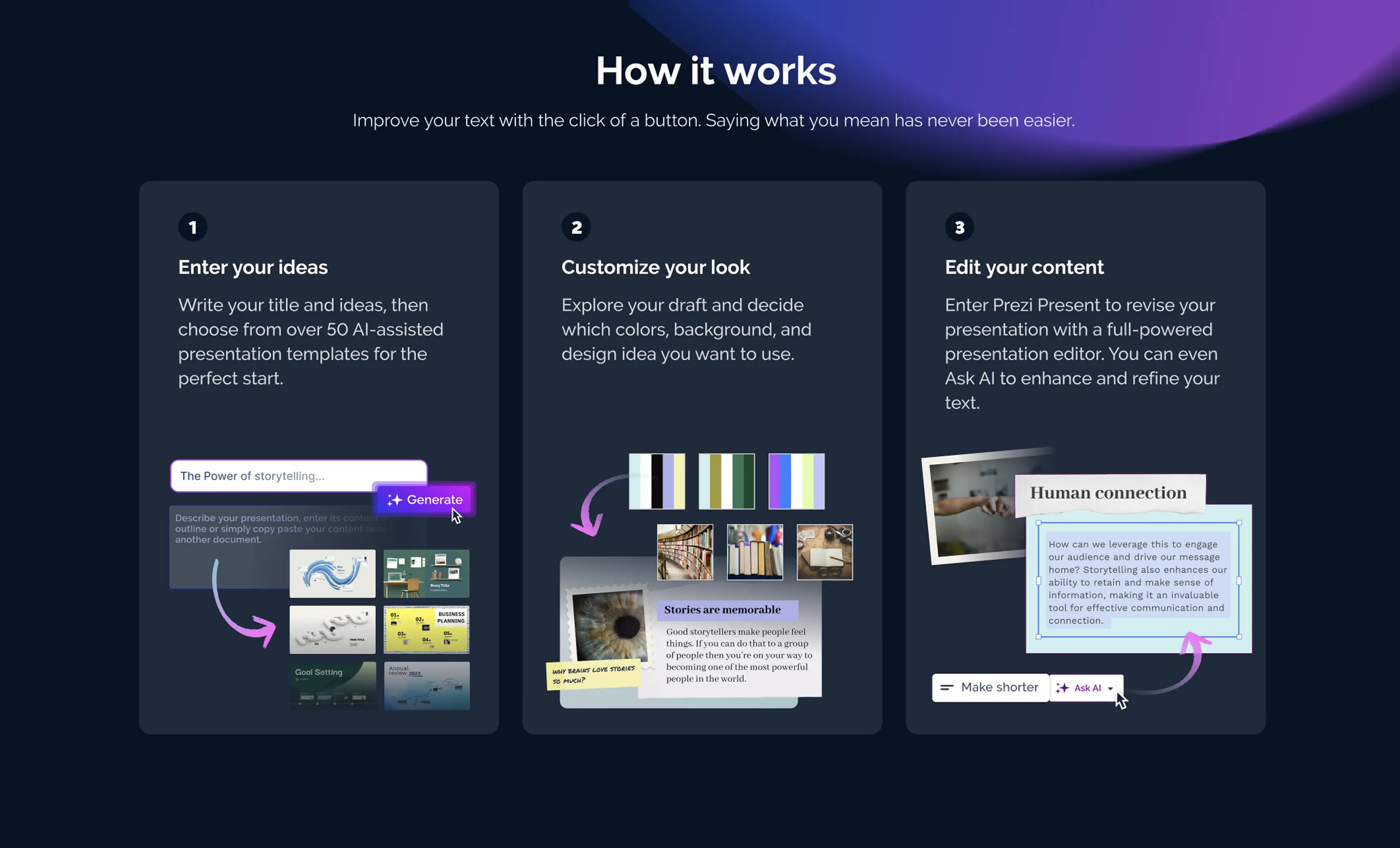
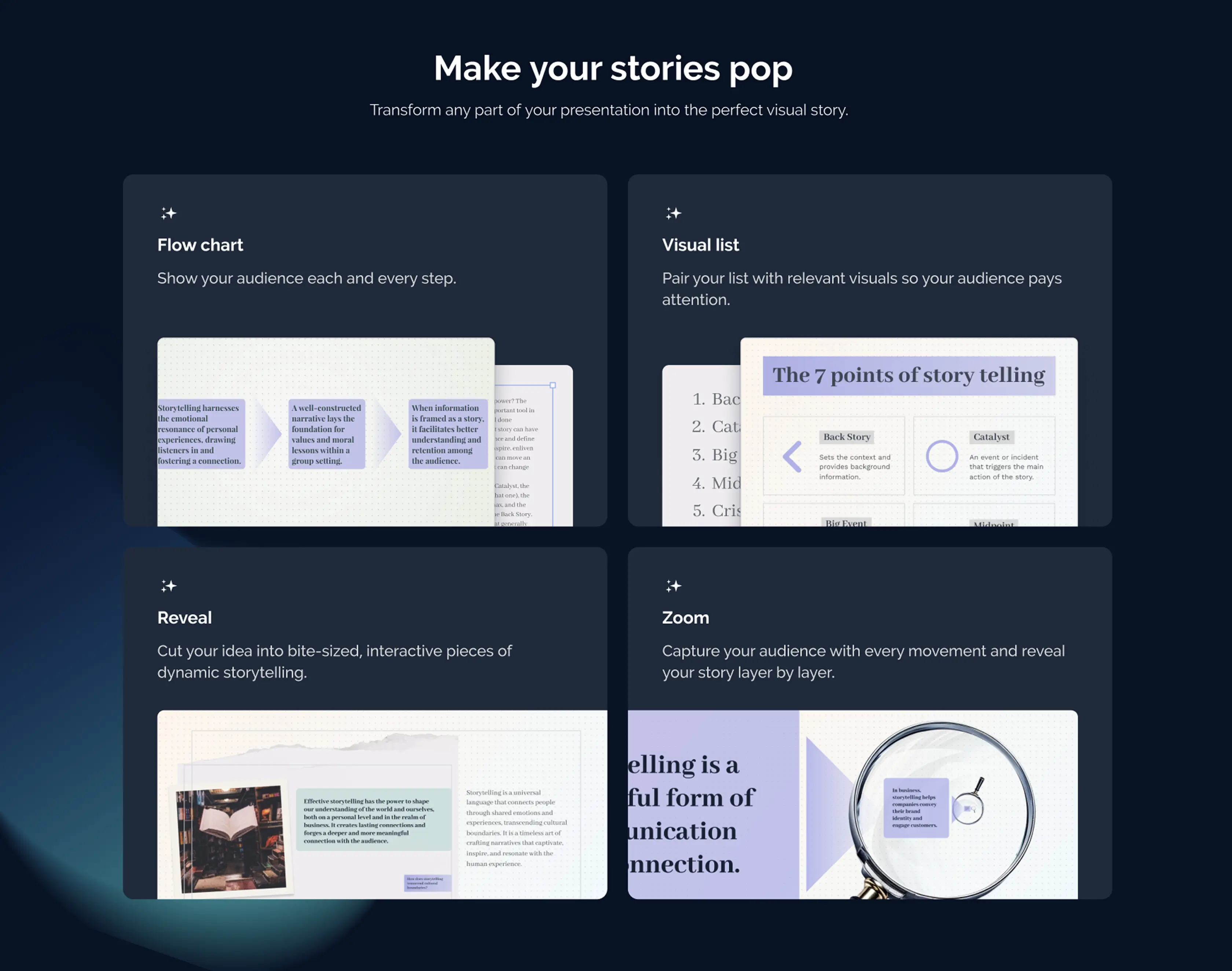
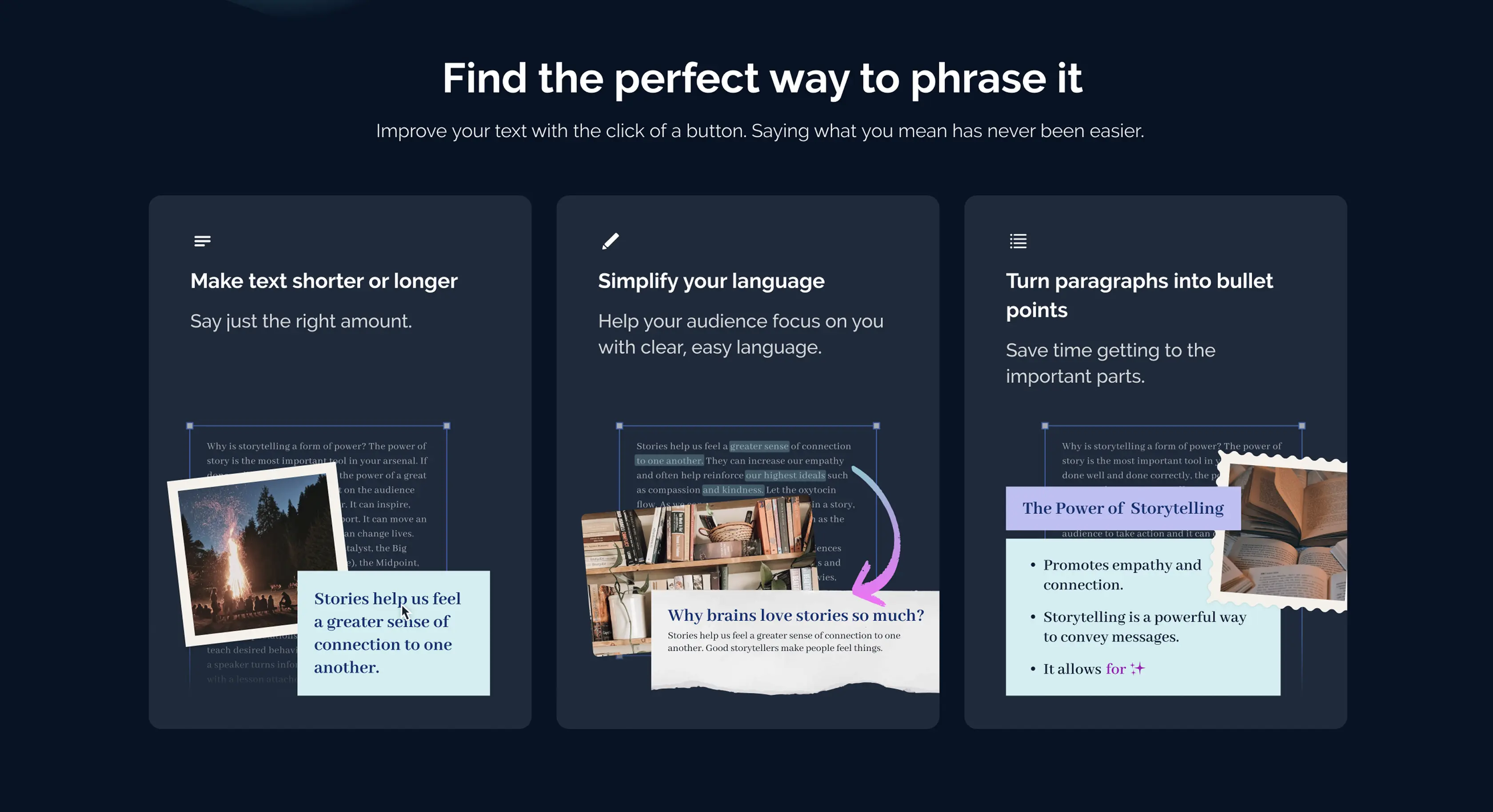
These sections explained the new workflow in a simple, step-by-step way. Breaking the process into smaller steps made it easier for users to understand how the product worked and discover its new features.
04
Result
Beyond the campaign itself, the system held up well enough that the resulting templates became some of the best examples produced by real users.
05
Reflection
This campaign marked the shift of the brand's visual language toward AI, inside and outside the product. It was the first time I had to design not just to communicate a feature, but to change how a technology is perceived — finding the point where simple didn't feel empty, and human didn't feel decorative.
"Simple didn't feel empty, and human didn't feel decorative."